Role: Product designer
Contribution: User Research, UX Design, UI Design, Prototyping, User Testing, Design System, Product Strategy, Handoff
Solution
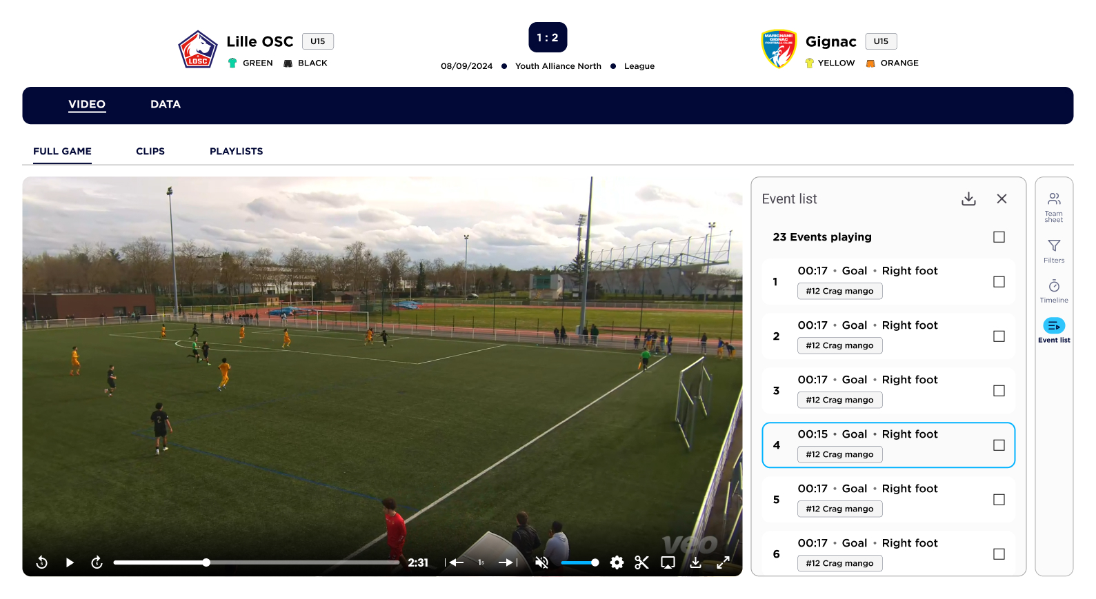
I redesigned the game page with a strong focus on video, as both data and user interviews confirmed it was the core element of the experience. Key improvements included:
• Enhancing the video experience: The game overview was streamlined, with its features repositioned to reduce clutter and prevent UI elements from overlapping the video.
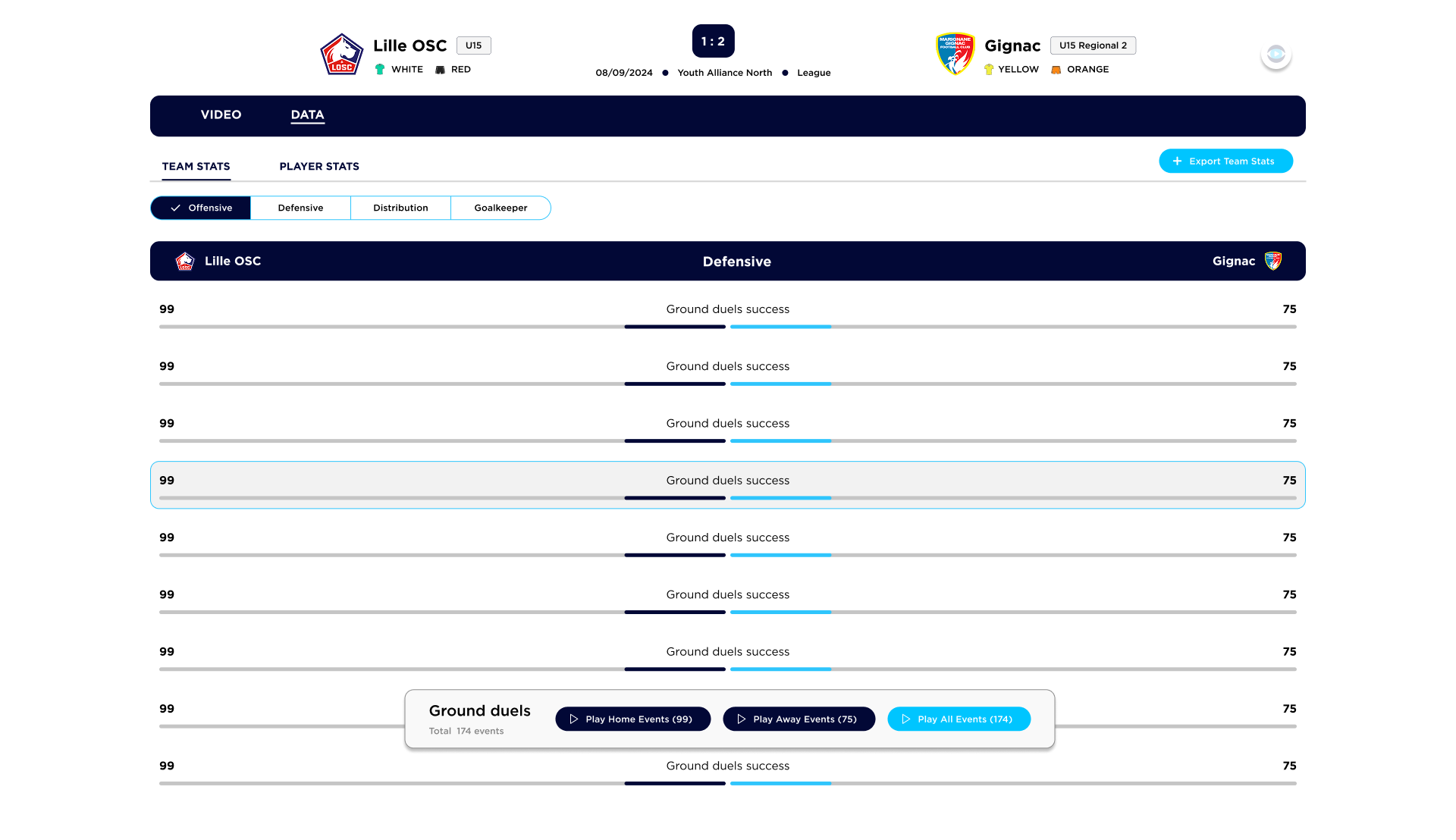
• Introducing a scalable tab system: This created a more structured, future-proof navigation model, ensuring consistency not only on the game page but across the platform.
• Prioritizing mobile usability: Mobile design was elevated from an afterthought to a key focus, dramatically improving the experience for users on smaller screens.


The Challenge
What started as a small design tweak quickly turned into a full overhaul of the game page. As we delved deeper, we uncovered several critical usability issues:
1. The hierarchy wasn’t intuitive, making it difficult for users to navigate.
2. Navigation was inconsistent, leading to confusion.
3. UI elements lacked synchronization, creating a fragmented experience.
4. The mobile experience had significant usability challenges.
Scope
Initially, the goal was to make a minor adjustment, but as we analyzed the page further, it became clear that a more comprehensive redesign was needed. The game page wasn’t just an isolated issue – many of its challenges reflected broader platform-wide inconsistencies. This project, therefore, became a guiding star for how the platform could evolve moving forward.
1. Analysing the hierarchy
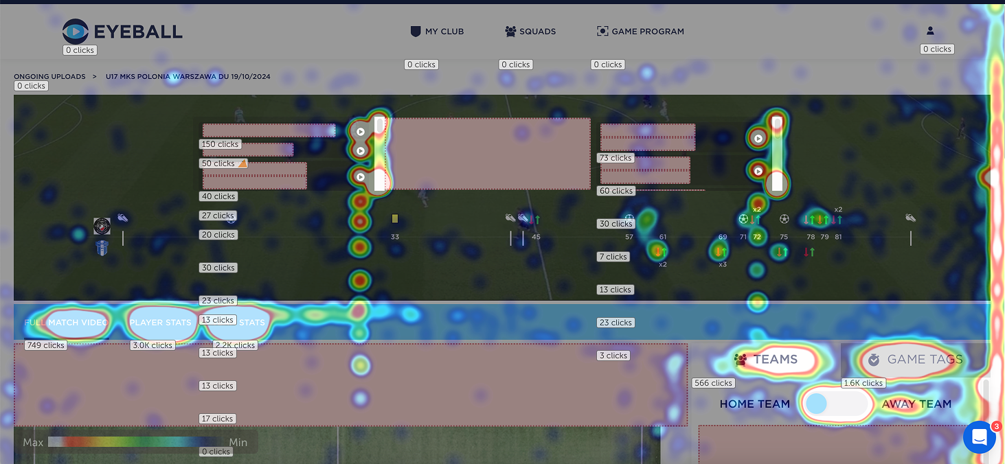
Heatmap (clicks) showing few click on top UI element
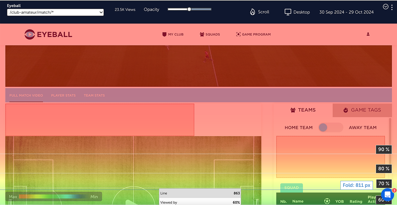
Heatmap (scroll) only 60% getting to video element
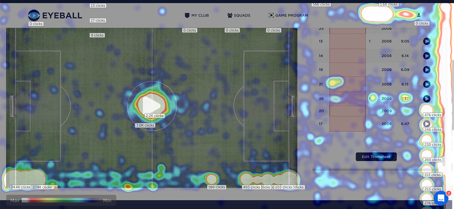
Heatmap (clicks) showing more click on video element and teamsheet
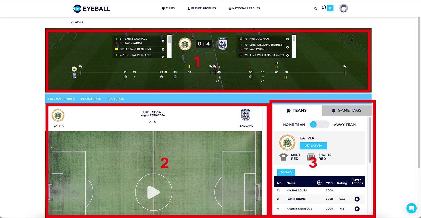
What if we could change the hierarchy?
2. Inconsistent navigation
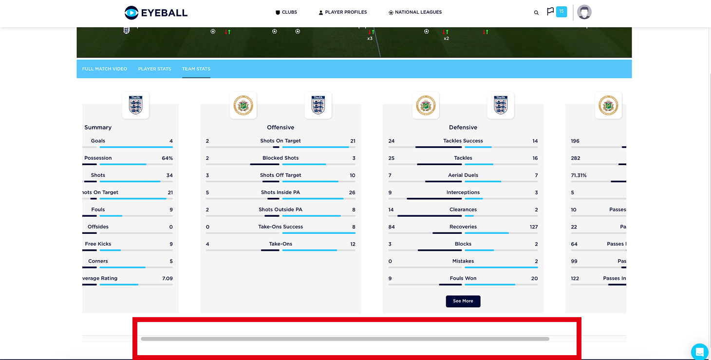
Inconsistent navigation: Horizontal scrolling (before)
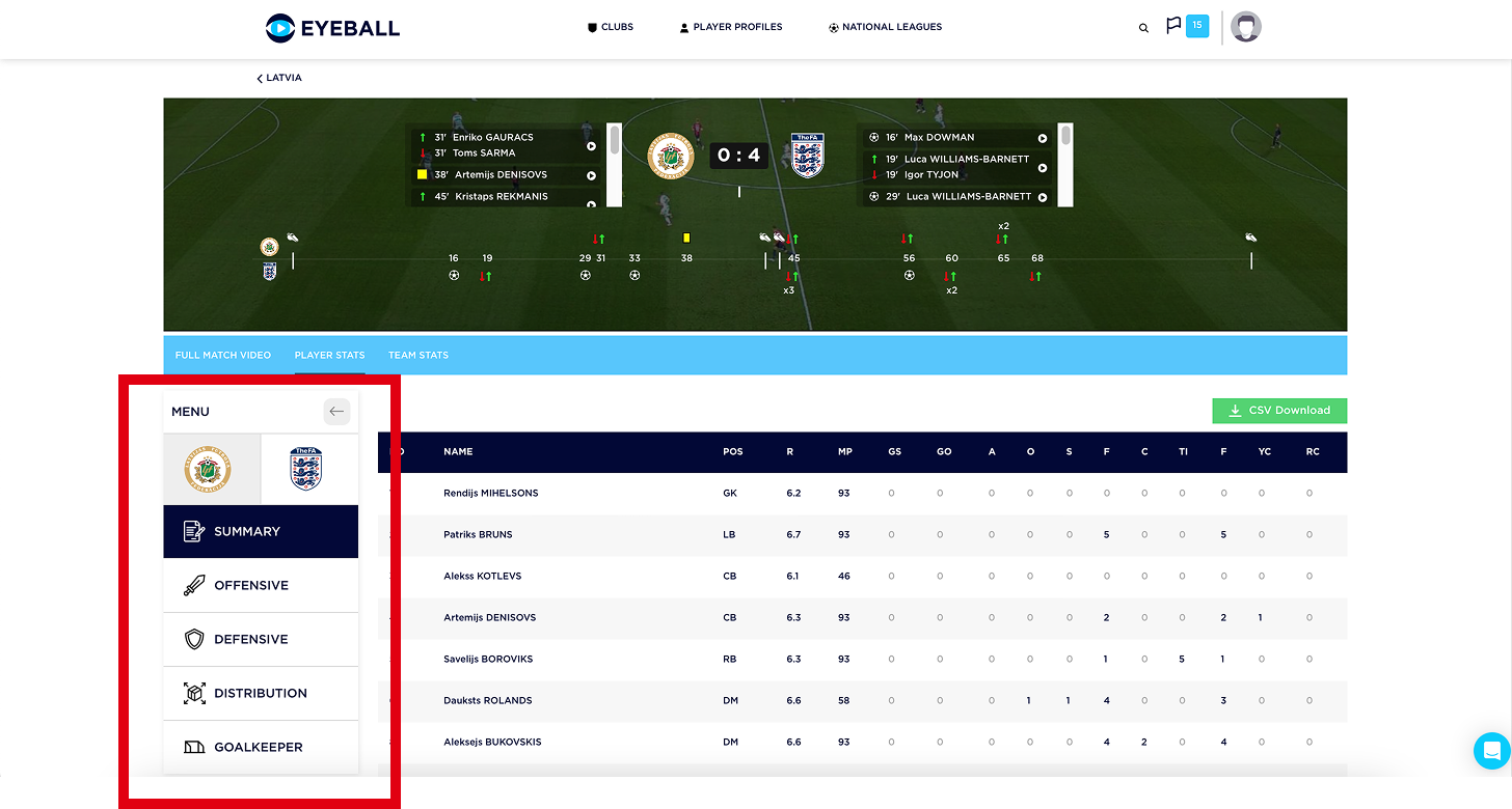
Inconsistent navigation: Tabs (before)
Consistent navigation: nested tabs (after)
3. Focus on mobile experience
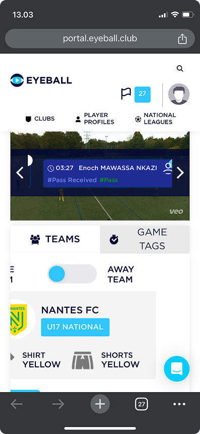
Mobile version before

Mobile version before
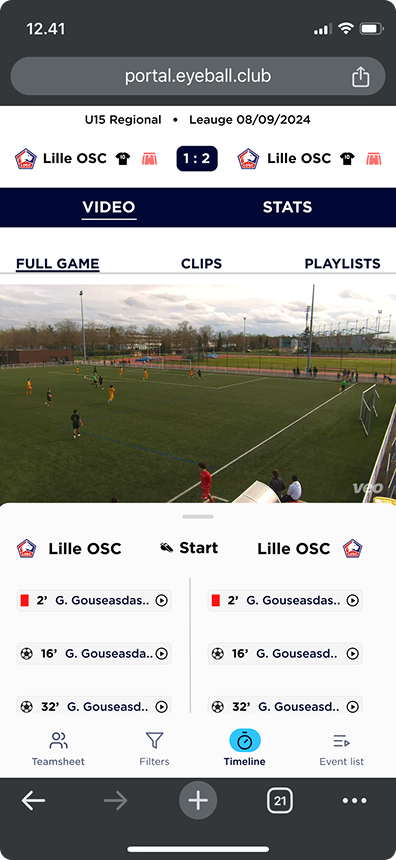
Mobile version after
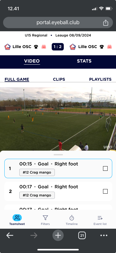
Mobile version after
The Impact
The new game page is now in production, and the redesign has been a turning point for the organization. It has demonstrated the value of data-driven and user-centered design, influencing how future platform iterations are approached. The company is shifting from a fragmented approach to a more structured and strategic way of improving the product.
